

Cracker Barrel and the War on American Authenticity
Everything in America looks the same and it's driving people crazy.

Evan Gottesman is the director of communications and special projects at Renew Democracy Initiative.
Over the weekend, a non-American friend asked me to explain the Cracker Barrel controversy.
This is the sort of question that draws a deep sigh, then a flush of embarrassment that our country’s politics are currently defined by something called the Cracker Barrel controversy.
But it got me thinking.
Before I dive in, a very brief summary for those who were distracted by less important things like the deployment of the National Guard in major cities:
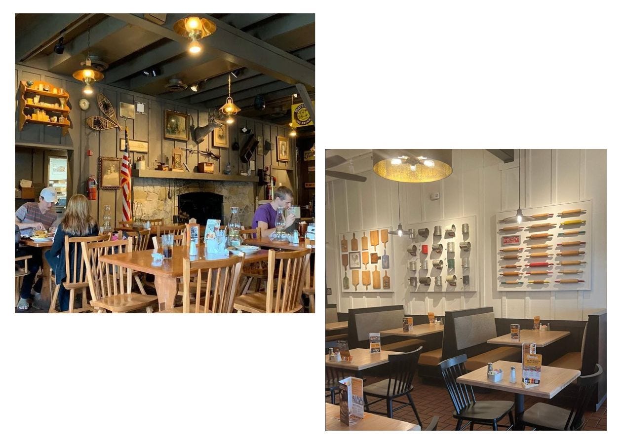
Cracker Barrel is a US restaurant chain specializing in southern cuisine, with all of the usuals: biscuits, mac and cheese, and fried chicken. Each Cracker Barrel outpost was decorated to make you feel like you were at your grandma’s; shelves and walls adorned by a personal collection of odds and ends treading the delicate line between endearing and hoarding. I last visited Cracker Barrel on a family road trip to Disney World over twenty years ago, and a cursory Google search showed that it looked pretty much the way I remembered.
That was, until recently.
Earlier this month, Cracker Barrel unveiled a rebrand.
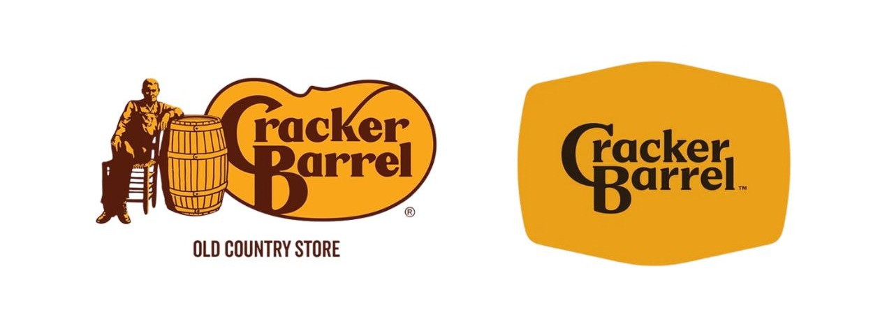
The thing that got the most attention was the logo.
The company drained it of all signs of life, removing the eponymous cracker barrel along with Uncle Herschel, a friendly-looking senior citizen who sat beside it.
Right-wing influencers latched onto the switch and cried “woke.” The company’s stocks took a serious hit (down 7.2% in one day). Donald Trump weighed in, saying that Cracker Barrel should restore its old logo. The Democrats’ official Twitter account joined the chorus to say that “we think the Cracker Barrel rebrand sucks too” (more bipartisanship like this?).
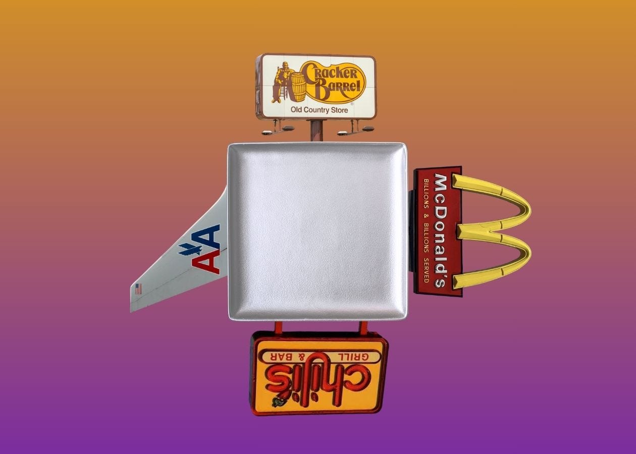
The Square Plates phenomenon
Yesterday, Cracker Barrel caved on the logo to give Uncle Herschel another lease on life.
Yet they’re staying the boring course on a second, more significant change: interior design. The company Marie Kondo’d the restaurant’s busy dining rooms, with once-haphazardly arranged knick knacks confined neatly into frames. Pieces of rustic furniture have been swapped with Ikea replacements.
Some right-wingers believe that Uncle Herschel (who, for what it’s worth, is white) was nearly dropped over the same concerns about racism that drove Aunt Jemima and Land-O-Lakes to change their packaging.
Yet like so many other moral panics, the Cracker Barrel crack-up isn’t actually about “woke.” Rather, it’s a creatively-bankrupt pursuit of fleeting marketing trends. I call it the Square Plates phenomenon, for the way restaurants and other companies flatten every aspect of their distinct identities right down to the dishware.
So there is something to the Cracker Barrel frustration, even if it isn’t “woke.” Everything in America looks the same these days, and it’s driving people crazy.
Cracker Barrel used to look like Cracker Barrel. Now it looks like anywhere else.
The crisis of American brand longevity
With minor modifications, the once (and now future) Cracker Barrel logo has been around since 1977.
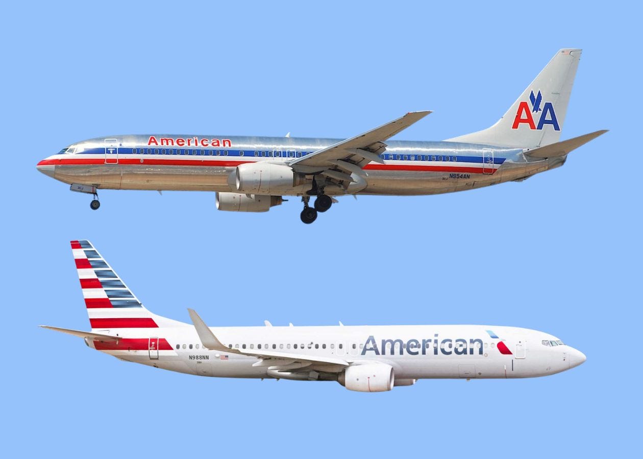
The restaurant isn’t the first US company to try to bin such a durable brand. A little over a decade back, American Airlines committed the aesthetic crime of the century when it trashed a timeless design.
In the 1960s, American Airlines recruited Italian graphic artist Massimo Vignelli to revamp their look.
You may not know Vignelli’s name, but if you’ve ever gone for a ride on the DC Metro or New York City Subway, you’ve seen his work in simple maps featuring blocky abstractions of geographic features and brightly colored train lines alongside signage distinguished by clean Helvetic font.
Vignelli took his signature style to American Airlines with a brand that was literally stripped down to its basics. It wasn’t bland Square Plates minimalism, but a unique, purposeful approach that made American’s outfit instantly stand out on the runway.
The carrier’s planes would be mostly unadorned, leaving them with a chrome-like finish, save for a red, white, and blue stripe running around the middle of the fuselage, a a simplified eagle on the tail, and one word—“American”—in the artist’s beloved Helvetica typeface. This, despite the fact that the trend in the airline industry at the time was to move toward more fully-painted exteriors.
The old American paint scheme was carried forward seamlessly from the world of Mad Men to fit on an iPhone app icon. Yet in 2013, American ditched its unique bare-metal brand in favor of something completely interchangeable with its competitors. Vignelli died the following year.
The overhaul was so jarring precisely because of the previous brand’s longevity.
The Cracker Barrel logo is now in its late forties, about the same age as Vignelli’s livery when American Airlines killed it.
Can you imagine any of today’s rebrands lasting for almost half a century?
It’s unthinkable. And here’s why.
Everything now is designed by committee. Focus groups have companies racing after trends for new looks that, generously, will last a decade before growing tired.
Not too long ago, McDonald’s moved from its red mansard-roof restaurants into sterile cubicles defined by muted color palettes. This came on the heels of the Super Size Me crisis, when the company faced scrutiny over its impact on child obesity and public health writ large.
I don’t want to glide over those concerns. However, the fact is that McDonald’s is not healthy. You can choose healthier options, but, let’s be real: if you get the McNuggets with a side of apple slices, you still have McNuggets.
Instead of owning up to its roots as a hamburger joint with a clown for a brand ambassador, McDonald’s tried to dress itself up as Panera, a decidedly duller place whose bread and butter is soup and salad.
There have been countless other casualties of Square Plates-ification.
Take Tex-Mex chain Chili’s, which once boasted an impressive array of southwestern-themed junk on its now-barren walls rivaling the old Cracker Barrel’s eclectic assortment of stuff. Chili’s recently opened a location near Scranton, Pennsylvania whose interior evokes its appearance from twenty years ago. Ostensibly, it’s a promotion tied to The Office, but Scranton’s vintage Chili’s now sticks out as an awkward, time-traveling visitor from a pre-Square Plates America.
Chasing fads, running from who we really are
The deeper lesson from the Cracker Barrel fiasco is not about some “woke” conspiracy. It’s that when we chase fads, we run away from who we really are.
Right now, there is an impulse among Democrats to try to beat MAGA by becoming MAGA. They desperately want to clone Joe Rogan or some other demagogue, Boys From Brazil-style.
This will never work.
What top Democrats don’t realize is that their party’s brand is toxic in large part because it’s inauthentic. Either they present their own platform tepidly, as if nervously waiting for voter approval, or they transparently try to copy the other guy. No one struggles to explain who Democrats are more than Democrats.
The MAGA brand is visually and tonally abrasive, and it perfectly matches the substance of what the American right is pushing for. Trying to put that wrapping on a liberal political party is like trying to… well, make a Cracker Barrel look chic.
Vignelli, the late master designer, dished out some scathing commentary when American Airlines threw his work in the dumpster. His words have enduring relevance for Democrats and for Cracker Barrel.
This is the typical mistake that company presidents make: ‘I'll change the logo, and the company will look new.’ What you have to have is a president who knows how to run the company, and in that process knows how to evaluate the brand identity.
Cracker Barrel was never supposed to be a fancy spot. It’s a roadside gift shop that doubles as a diner. That’s OK—it could even be great, if only they would own it.
Registration for our first paid subscriber Zoom call with Garry Kasparov is now open! Upgrade and sign up today.
More from The Next Move:
What the Hell Is a “NATO-Style Security Guarantee” for Ukraine?

More meaningless jargon from the foreign policy blob on NATO, Ukraine, and Russia.
How to Teach the TikTok Generation That America Isn’t China

The kids are right to be concerned about our country’s direction, but social media-fueled despair won’t help us.
I haven’t heard anyone say it, but I think they’re trying to be more like Golden Corral.
For that, make a buffet.
I hate when companies blow a bunch of money on things only execs care about. They would get better results and media coverage by giving the money to the working staff (cooks and waiters).
Speaking of politics and changing brands ...
I'm reminded of Richard Nixon's comeback as a smiling, not-as-smarmy-as-before candidate for president, branded as "The New Nixon." At around the same time, Standard Oil re-branded their Esso gas stations with the name "Exxon." This inspired cartoons, bumper stickers, etc., with the line "Nixxon - new name, but the same old gas."